28 Oct 10 BEST LANDING PAGE STRATEGIES AND REAL LIFE EXAMPLES
Creating a landing page is more than just arranging a few elements and adding a call-to-action button; it’s like crafting a first handshake, an introduction, or a quick conversation at a networking event. The magic of a landing page is that it can work as a 24/7 salesperson—only if it’s done right. The most successful landing pages don’t just talk; they tell a story. They aren’t just a placeholder on the web; they’re interactive and inspire trust, curiosity, and action.
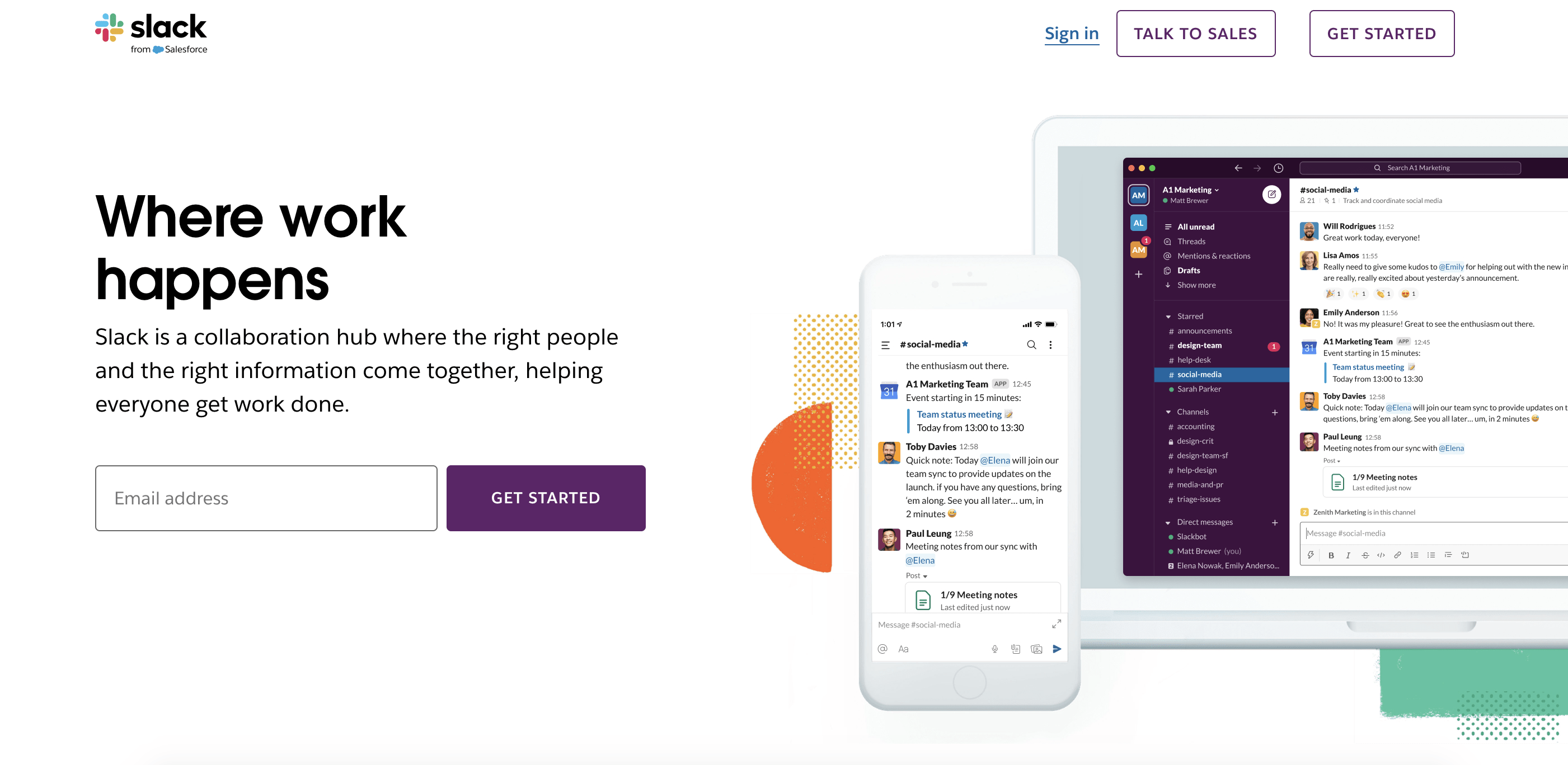
Have you ever come across a landing page that made you think, “Wow, I need this!” That’s not just good design; it’s powerful psychology at play, where each component is a carefully selected piece of a puzzle designed to drive a specific action. Take Slack’s landing page: it doesn’t waste your time with a novel. Instead, you’re met with a simple line—”Where Work Happens.” In a split second, Slack has communicated its purpose, helping you connect with teammates and collaborate seamlessly.
So, let’s get fired up about landing pages! Here at Amra and Elma, we break down not just what goes into a landing page but how to transform yours into an undeniable conversion machine. I’m about to share some hard-won, proven techniques that top brands use every day to optimize landing pages that spark action. Get ready to see how simplicity, storytelling, and psychology come together to drive conversions in the most personal way possible.
10 BEST LANDING PAGES STRATEGIES AND REAL-LIFE EXAMPLES
1. Grab Attention with a Headline that Hits Home
2. Highlight Real Benefits in the Subheadline
3. Use Powerful, High-Quality Visuals to Tell Your Story
4. Include an Unmissable Call-to-Action (CTA)
5. Build Trust with Testimonials and Social Proof
6. Keep the Design Simple and Clean
7. Create a Clear Value Proposition
8. Optimize for Mobile
9. Leverage Detailed Testimonials or Case Studies
10. Test, Test, Test! (And then Test Again)
What is a Landing Page? (and Why Does it Matter?)
A landing page is more than just another page on a website; it’s a focused experience designed to guide visitors toward a single goal. When done right, a landing page feels like a one-on-one conversation where every word, image, and call-to-action (CTA) is tailored to nudge visitors into taking a specific action, like signing up, purchasing, or downloading.
Imagine a landing page as a finely tuned invitation. It’s the destination where your audience lands after clicking on an ad, social media post, or email link. Unlike a traditional webpage filled with multiple paths and information, a landing page is clear, concise, and entirely dedicated to one purpose: conversion.
The Unique Power of a Landing Page
Landing pages serve as digital matchmakers, making a direct appeal to the visitor’s needs or desires. Think about your homepage, which might aim to introduce your brand broadly, showcasing various elements like services, products, and an “About” section. A landing page, on the other hand, narrows the focus to one specific message and outcome. The simplicity here is powerful—think of it as a curated tour where every step has a purpose.
Take Airbnb as an example. Their landing page is designed to build trust with prospective guests and hosts. Instead of merely listing properties, Airbnb showcases real people, real reviews, and personalized recommendations, which creates a sense of community and authenticity. By emphasizing trust, they transform strangers into guests or hosts who feel connected and comfortable, ultimately leading to higher conversion rates. Airbnb’s landing page aligns perfectly with its core values, proving that the first few seconds are vital to conveying trust, value, and intent.
Landing pages also enable brands to connect with their audiences on a more personal level. When crafting your landing page, consider it as a message crafted for one individual with one clear purpose. This requires every element—text, colors, images, and CTAs—to work harmoniously toward encouraging the desired action.
Components of a High-Converting Landing Page
A landing page isn’t just about pretty visuals or catchy copy. Each component should serve a strategic role, guiding visitors smoothly down the page and building momentum toward the CTA. Here’s a breakdown of each key component and how it contributes to a cohesive and effective user experience:
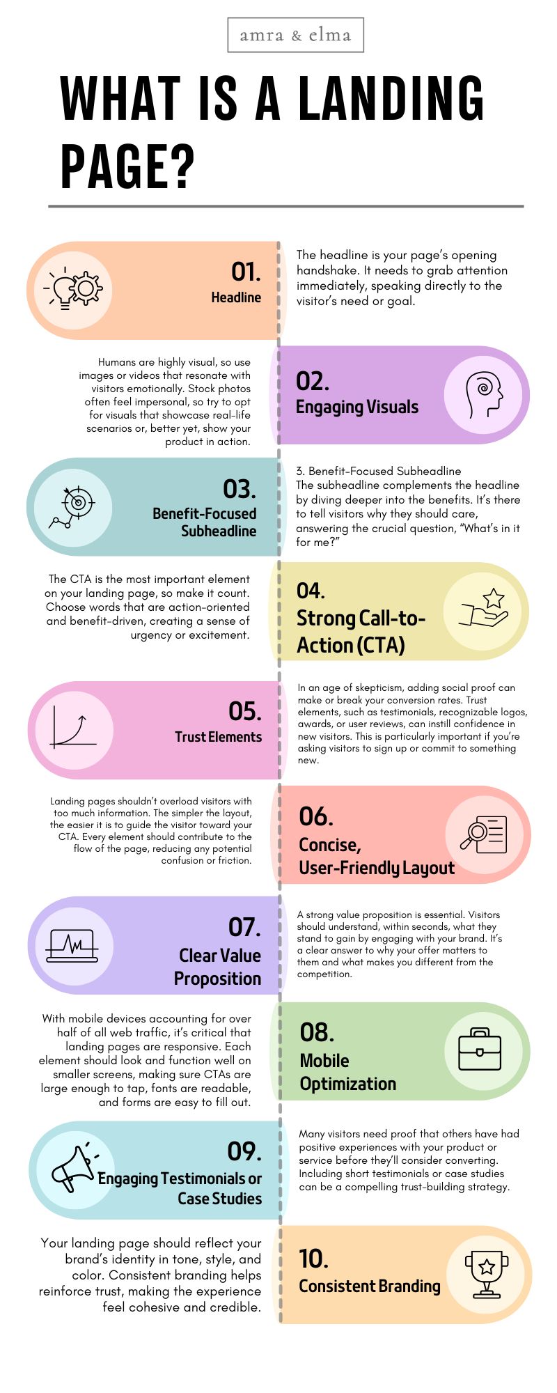
- Headline
The headline is your page’s opening handshake. It needs to grab attention immediately, speaking directly to the visitor’s need or goal. A great headline doesn’t just describe; it entices.- Example: “Where Work Connects”—Asana uses this as a headline that instantly tells potential users what they’ll achieve. The simplicity and relevance appeal directly to the efficiency-seeking project manager. This headline isn’t about Asana as a tool; it’s about solving a need, making it highly compelling.
- Engaging Visuals
Humans are highly visual, so use images or videos that resonate with visitors emotionally. Stock photos often feel impersonal, so try to opt for visuals that showcase real-life scenarios or, better yet, show your product in action.- Example: Dropbox does this by displaying a visual of its interface, helping potential users envision how it would fit into their workflow. It’s a small touch but an impactful one—this visual helps visitors think, “I can see myself using this.”
- Benefit-Focused Subheadline
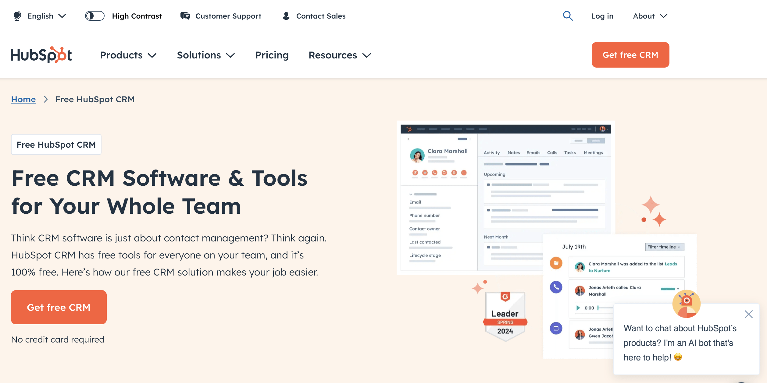
The subheadline complements the headline by diving deeper into the benefits. It’s there to tell visitors why they should care, answering the crucial question, “What’s in it for me?”- Example: HubSpot’s CRM landing page has a subheadline that reads, “Everything you need to organize, track, and nurture your leads” and “Free CRM Tools.” It’s a line that speaks directly to sales professionals and marketers, promising a complete toolkit. This approach appeals directly to the visitor’s desire for a comprehensive, all-in-one solution.
- Strong Call-to-Action (CTA)
The CTA is the most important element on your landing page, so make it count. Choose words that are action-oriented and benefit-driven, creating a sense of urgency or excitement.- Example: Dropbox invites visitors to “Try Dropbox Business free.” By emphasizing the “free” trial, Dropbox eliminates the perceived risk, making it easy for business-minded users to test the waters without financial commitment.
- Trust Elements
In an age of skepticism, adding social proof can make or break your conversion rates. Trust elements, such as testimonials, recognizable logos, awards, or user reviews, can instill confidence in new visitors. This is particularly important if you’re asking visitors to sign up or commit to something new.- Example: Slack leverages brand logos of high-profile clients like BBC, Trivago, and Oracle on its landing page. This immediately signals credibility, appealing to business professionals who might otherwise hesitate. Displaying the brands they work with validates Slack’s effectiveness, making it easier for newcomers to trust them.
- Concise, User-Friendly Layout
Landing pages shouldn’t overload visitors with too much information. The simpler the layout, the easier it is to guide the visitor toward your CTA. Every element should contribute to the flow of the page, reducing any potential confusion or friction.- Example: TeamSupport keeps its landing page minimal, focusing on a single CTA with just a few key benefits. The straightforward layout directs the user’s attention to the main selling points and CTA without unnecessary distractions, increasing the chances of conversion.
- Clear Value Proposition
A strong value proposition is essential. Visitors should understand, within seconds, what they stand to gain by engaging with your brand. It’s a clear answer to why your offer matters to them and what makes you different from the competition.- Example 1: Resource Guru provides a video demo of their time management tool on their landing page, instantly showing visitors how the platform addresses common challenges in team scheduling. This immediate clarity and visual appeal make the page highly persuasive for potential users.
- Example 2: Just Markets offers a clear value proposition by highlighting deposit multiplication with 50% JM bonus.
- Mobile Optimization
With mobile devices accounting for over half of all web traffic, it’s critical that landing pages are responsive. Each element should look and function well on smaller screens, making sure CTAs are large enough to tap, fonts are readable, and forms are easy to fill out.- Example: Dropbox optimizes every aspect of its landing page for mobile, ensuring a smooth, visually pleasing experience on any device. By making it mobile-friendly, Dropbox keeps the experience seamless and engaging for all users.
- Engaging Testimonials or Case Studies
Many visitors need proof that others have had positive experiences with your product or service before they’ll consider converting. Including short testimonials or case studies can be a compelling trust-building strategy.- Example: Intercom uses customer testimonials on their landing page, showcasing quotes from happy customers. These testimonials reassure visitors that Intercom is effective and well-loved, reducing hesitation for first-time users.
- Consistent Branding
Your landing page should reflect your brand’s identity in tone, style, and color. Consistent branding helps reinforce trust, making the experience feel cohesive and credible.
- Example: Nike maintains its distinctive brand style with powerful visuals and athletic storytelling, keeping every aspect of the page aligned with its brand identity. This consistency creates a strong impression that resonates with Nike’s active, driven audience.
Each of these elements has a role in creating a seamless user journey that’s both intuitive and persuasive. With a well-crafted landing page, you have the potential to connect with your audience in a highly personalized way, inviting them to take the next step with confidence.
10 Best Strategies to Optimize Landing Pages for Conversions (with Real-Life Examples)
Landing pages are often the first stop in a customer’s journey and can either make or break a sale. When optimized correctly, a landing page doesn’t just inform; it connects, persuades, and converts. Here, we’ll walk through ten in-depth strategies with detailed explanations and examples, breaking down each element so you can build a page that truly performs.
Landing Page Strategy #1. Grab Attention with a Headline that Hits Home
- Strategy: The headline is the foundation of a landing page. Visitors often decide within seconds whether they’ll engage or leave, and your headline has to do the heavy lifting. The best headlines communicate an immediate benefit or address a common pain point without unnecessary fluff. Avoid overly technical language; instead, go for clarity and emotional resonance.
- Example: Slack opens with a simple headline: “Where Work Happens.” This line isn’t about the technicalities of the platform but speaks directly to the modern worker’s desire for a streamlined work environment. It establishes Slack as the place where effective communication and productivity thrive—something every team aspires to achieve.
- Why It Works: This headline doesn’t waste time explaining what Slack is; it jumps right to the result that Slack users can expect. It creates instant relatability, making the product feel like a natural solution for anyone who needs a connected workplace.
- Takeaway: Make your headline brief yet powerful. It should instantly connect with the visitor’s goals and offer a clear benefit. Avoid jargon and instead focus on how the product or service will impact the visitor’s life or work.
Landing Page Strategy #2. Highlight Real Benefits in the Subheadline
- Strategy: While the headline grabs attention, the subheadline builds interest by describing how the product or service meets specific needs. It’s essential to reinforce the promise made in the headline with tangible benefits or outcomes. A strong subheadline can turn casual interest into engagement by making the offer relevant and actionable.
- Example: HubSpot’s CRM landing page uses the subheadline, “Everything you need to organize, track, and nurture your leads” and “Everything you need to organize, track, and nurture your leads.” This phrase speaks directly to the core functions that marketers and salespeople seek. It suggests that HubSpot is more than just a CRM—it’s an all-in-one solution that makes lead management efficient and intuitive and you can try it for free.
- Why It Works: By highlighting HubSpot as a comprehensive tool, the subheadline appeals to busy professionals looking for a single solution rather than juggling multiple tools. It provides a sense of completeness, reassuring users that they won’t need to look elsewhere.
- Takeaway: Use the subheadline to provide clarity on the headline’s promise. Avoid vague or overly promotional language; instead, focus on the concrete benefits your product delivers.
Landing Page Strategy #3. Use Powerful, High-Quality Visuals to Tell Your Story
- Strategy: Visuals play a crucial role in conveying the brand’s message. Rather than opting for generic stock photos, select images or videos that portray the product’s real use. High-quality visuals can evoke emotions, showcase functionality, and help visitors visualize themselves using the product, creating a more immersive experience.
- Example: Dropbox uses screenshots of its interface, allowing visitors to see exactly what they’ll be working with. Instead of vague product descriptions, Dropbox’s visuals give users a taste of the product’s look and feel, making it easier to imagine how they might incorporate it into their daily workflow.
- Why It Works: By showing real-life functionality, Dropbox eliminates potential confusion about how the product works. Users can immediately understand what they’re signing up for, which can be particularly helpful in competitive, feature-rich markets like file storage.
- Takeaway: Use visuals that enhance the visitor’s understanding of your product. Show the product in action or demonstrate its benefits, helping potential customers connect emotionally and intellectually.
Landing Page Strategy #4. Include an Unmissable Call-to-Action (CTA)
- visitors toward the desired action. Use clear, benefit-driven language and make the CTA button visually stand out. Words that emphasize urgency or value (like “free,” “now,” “join”) make CTAs more compelling. Also, consider multiple CTA placements for longer pages to keep it accessible.
- Example: HubSpot uses a “Get Started for Free” CTA, which is clear, risk-free, and inviting. It’s not just a request but an offer that’s hard to resist because it encourages visitors to explore the product without commitment. The button is designed to stand out against the rest of the page’s elements, making it easy to find and click.
- Why It Works: The word “free” is powerful in reducing hesitation, especially for first-time users. By making the CTA about the user’s action (starting something beneficial), HubSpot shifts the focus from themselves to the visitor, making the interaction feel personal.
- Takeaway: Keep your CTA simple, visible, and benefit-focused. Use language that addresses what the visitor will gain by clicking, and make sure the CTA stands out visually.
Landing Page Strategy #6. Keep the Design Simple and Clean
- Strategy: A cluttered design can quickly overwhelm visitors, leading to increased bounce rates. A clean design, on the other hand, enhances readability and keeps users focused on the CTA. Stick to minimal elements, keep text concise, and ensure that each section flows logically toward conversion.
- Example: TeamSupport keeps a streamlined design with one primary CTA, focusing visitors’ attention on booking a demo. This approach prevents confusion by presenting only essential information, making it easy for visitors to follow a clear path to conversion.
- Why It Works: Simplicity minimizes distractions, reduces cognitive load, and allows visitors to navigate the page intuitively. This sense of clarity increases engagement and makes the decision-making process easier.
- Takeaway: Prioritize clean design. Use ample white space, and keep information easy to scan, guiding visitors naturally from headline to CTA.
Landing Page Strategy #7. Create a Clear Value Proposition
- Strategy: A landing page’s value proposition should answer the question, “Why should I choose this product?” It should communicate the product’s unique benefit or advantage, ideally highlighting specific pain points it resolves. This helps visitors see why they should choose you over competitors.
- Example: Resource Guru’s landing page features a headline and demo video emphasizing how the tool solves scheduling conflicts, making team management easier. By visually showcasing its functionality, Resource Guru shows rather than tells, which is often more effective for comprehension.
- Why It Works: The focus on a specific benefit—preventing scheduling chaos—helps visitors immediately understand how Resource Guru is relevant to them. The clarity of the message reinforces the value proposition, making it compelling for those who struggle with complex scheduling.
- Takeaway: Make your value proposition specific and relevant to the visitor’s challenges. Whether through text or visuals, communicate why your product is the best solution for them.
Landing Page Strategy #8. Optimize for Mobile
- Strategy: With more people browsing on mobile devices, mobile optimization is essential. Responsive design, touch-friendly buttons, and mobile-friendly forms enhance usability, reducing friction for users on smaller screens.
- Example: Dropbox has a fully responsive landing page design that adapts to any screen size, with touch-friendly buttons and simplified navigation. Dropbox’s mobile optimization ensures that users can access all information and complete actions without issues.
- Why It Works: By focusing on the mobile experience, Dropbox prevents visitors from encountering obstacles that might lead them to abandon the page. Mobile optimization creates a smoother user journey, increasing engagement and conversions across all devices.
- Takeaway: Test your page on different devices to ensure it’s optimized for mobile. Simplify navigation, use larger text, and make buttons easy to tap to enhance the user experience on smaller screens.
Landing Page Strategy #9. Leverage Detailed Testimonials or Case Studies
- Strategy: Case studies and testimonials provide essential social proof by showcasing real, measurable results that your product or service has achieved. For visitors on the fence, these stories act as a validation, offering tangible evidence of success. Detailed testimonials, including customer names, roles, and company names, make success stories more credible and relatable, helping potential clients envision similar benefits for their own needs.
- Example: Intercom features customer testimonials that highlight specific improvements in customer support and communication. These testimonials often include specific metrics, such as “reduced support response time by 30%,” offering visitors a quantifiable sense of the platform’s impact. By providing these detailed insights, Intercom showcases how its platform has delivered concrete results, which adds an emotional and logical appeal, building confidence for potential customers.
- Why It Works: Testimonials and case studies speak directly to visitor concerns about credibility and effectiveness. By offering specific numbers and real examples, Intercom enables visitors to see the exact ways the platform could benefit them. This kind of social proof reassures potential customers that they’re making a reliable choice.
- Takeaway: Include testimonials that highlight specific, measurable outcomes and make them as relatable as possible. Use real names and company names whenever feasible to increase credibility. Case studies that narrate challenges, solutions, and successes make a strong impact, reassuring visitors that your product delivers real, valuable results.
Landing Page Strategy #10. Test, Test, Test! (And then Test Again)
- Strategy: Testing is essential because user behavior varies, and even minor adjustments can significantly impact conversion rates. A/B testing (or split testing) allows you to experiment with different elements—such as headlines, CTAs, images, colors, and layouts—to determine what resonates most with your audience. Regular testing means your landing page stays optimized and responsive to user needs, trends, and preferences. This process also allows you to identify specific variables that drive conversions, improving the overall user experience.
- Example: Crazy Egg, known for its data-driven approach, continuously tests landing page elements to refine their effectiveness. By experimenting with variations in CTA colors, button placements, and headline formats, Crazy Egg identifies the most effective combinations to boost engagement and conversions. They constantly update and tweak their page design based on real user behavior, which allows them to stay competitive and responsive to evolving trends.
- Why It Works: Continuous testing is a data-backed way to ensure your page meets the needs of your audience. Rather than relying on assumptions, Crazy Egg’s approach gathers insights directly from user interactions, enabling the team to make informed, effective changes that enhance the landing page’s performance.
- Takeaway: A/B testing isn’t a one-time task—it’s an ongoing process. Test headlines, images, CTA placements, and even minor details like color choices to understand what works best for your visitors. By making data-driven improvements, you can optimize the page continually and keep conversion rates high.


Landing Page Strategy #5. Build Trust with Testimonials and Social Proof